5.4.7 Arts Foundation, Mullinville, KS
M.T. Liggett Art Environment Visitors Center
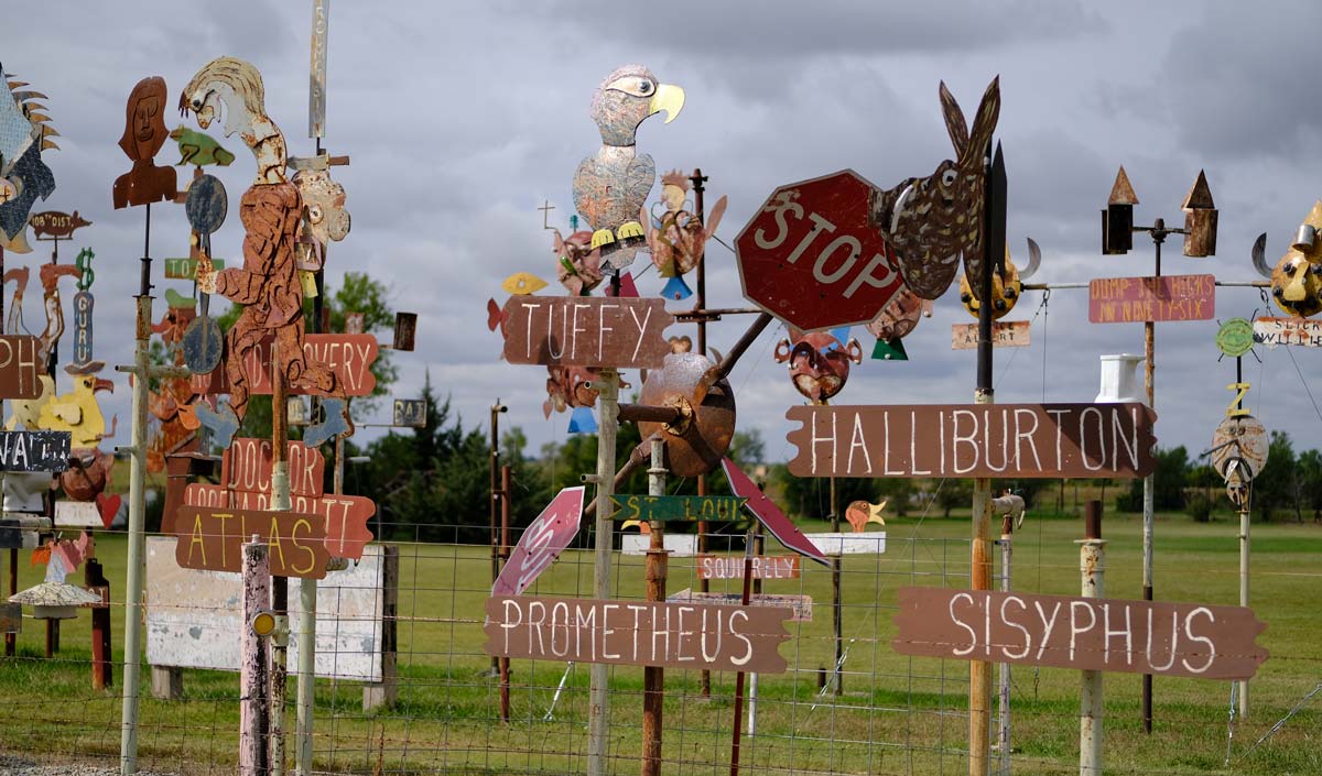
M.T. Liggett is known for his confrontational and controversial sculptures, signs, totems, and whirligigs. Liggett's work is unique. Iconic. And abrasive.
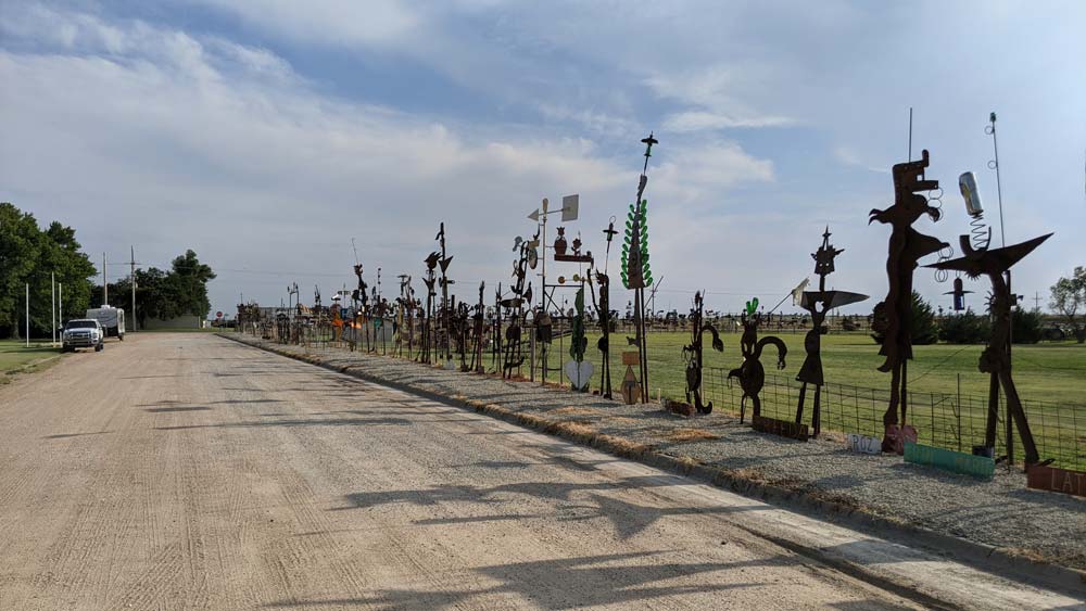
Visitors to the area can view over 600 of his metal sculptures along a roadside in rural Kansas at any time. But shortly after his death in 2017, work began to tell the story of the artist and the impact he's made.
In 2020, the 5.4.7 Arts Center hired FHD to design an interpretive exhibit to be housed in a newly constructed visitor center on the site of Liggett's studio.
The Space
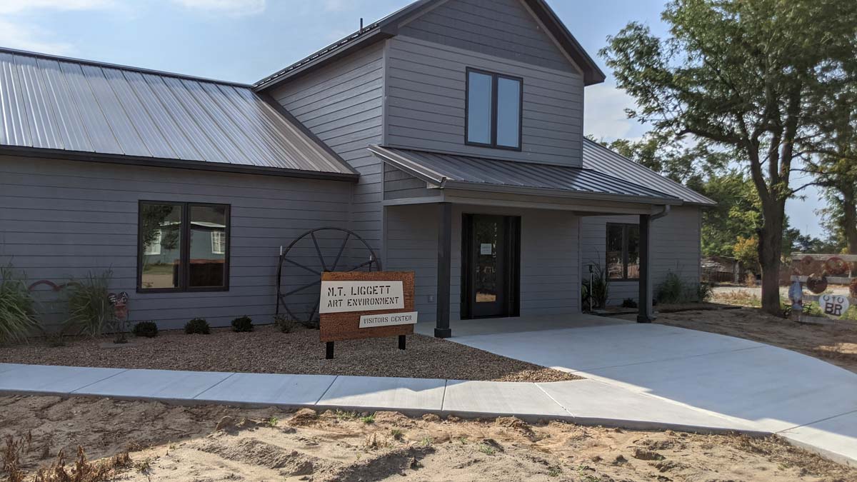
The M.T Liggett Art Environment Visitors Center was constructed on the site of Liggett's studio and is surrounded by his sculptures which line the fence around his property.
The Kohler Foundation committed to the two-year project of restoring and preserving the nearly 600 large metal totems as well as 500+ metal hearts and other small pieces. The new visitor center building was also part of the Kohler Foundation's conservation initiative.
Exhibit Planning
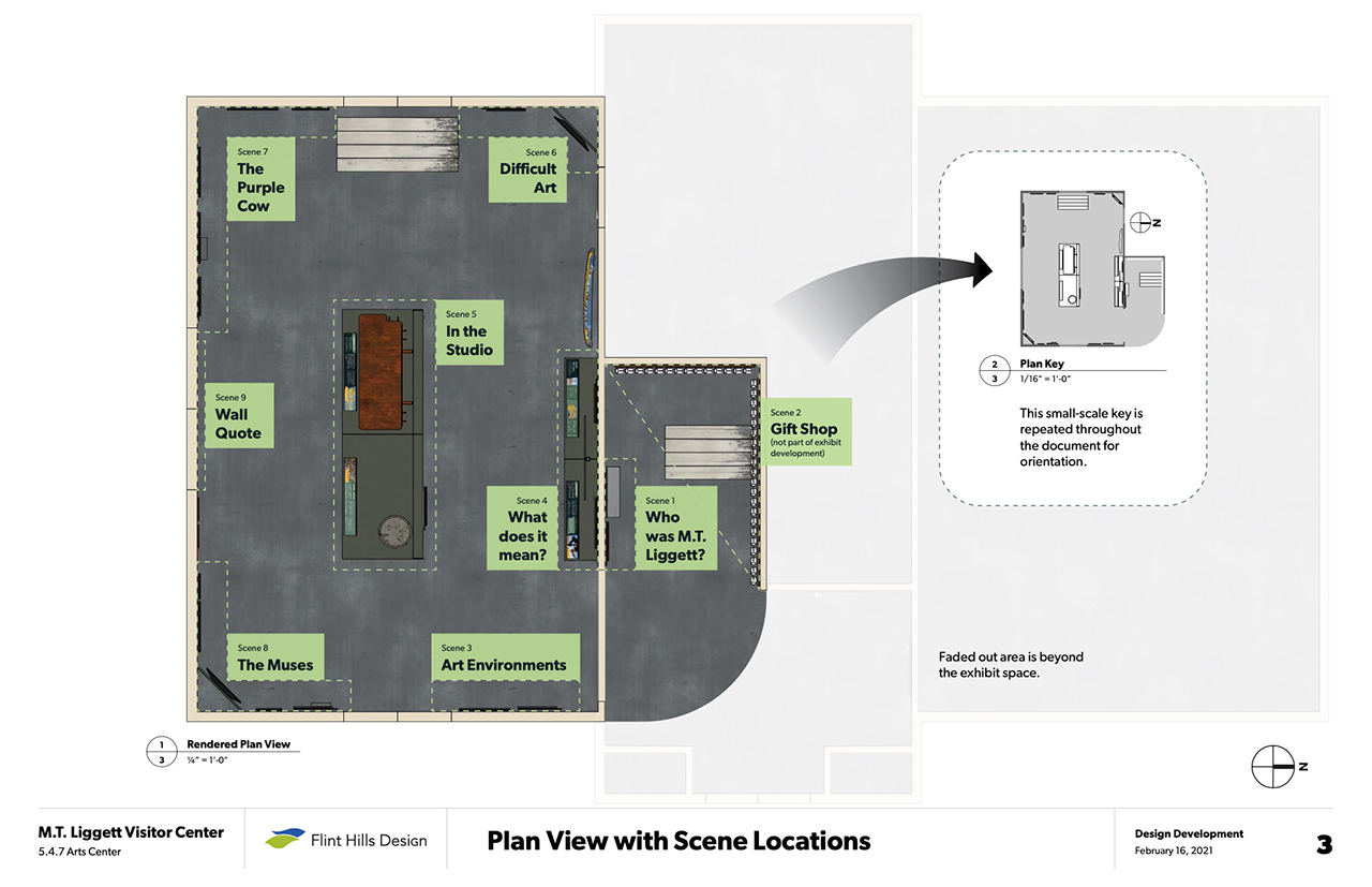
The building itself is split in two: one half with the interpretive exhibit, and the other half housing a workshop and living quarters for a local artist-in-residence.
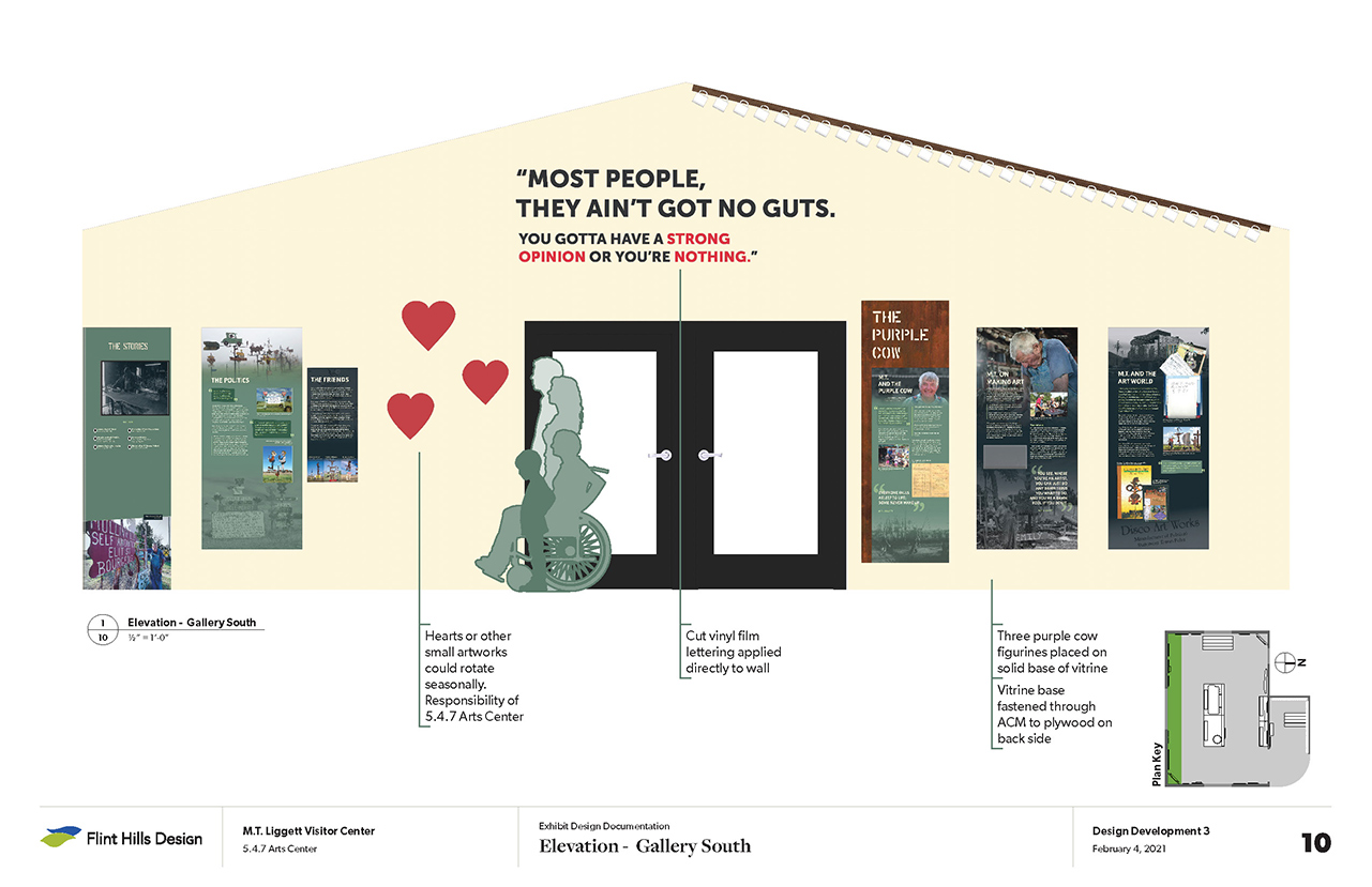
Early in the project we measure the space noting windows, doors, return vents, outlets, smoke detectors, and anything else that we need to design around. From these measurements we create floor plans and elevations as we begin to block in the sections of the exhibit.
A Digital Approach
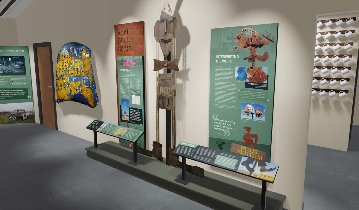
We also create a digital, 3D model of the space that we can then populate with the elements and displays for the exhibit. This model is updated often as new designs or elements are developed. So we're able to more easily visualize what the exhibit will look like throughout the process. Take a look at our animated walkthrough!
Exhibit Content & Organization
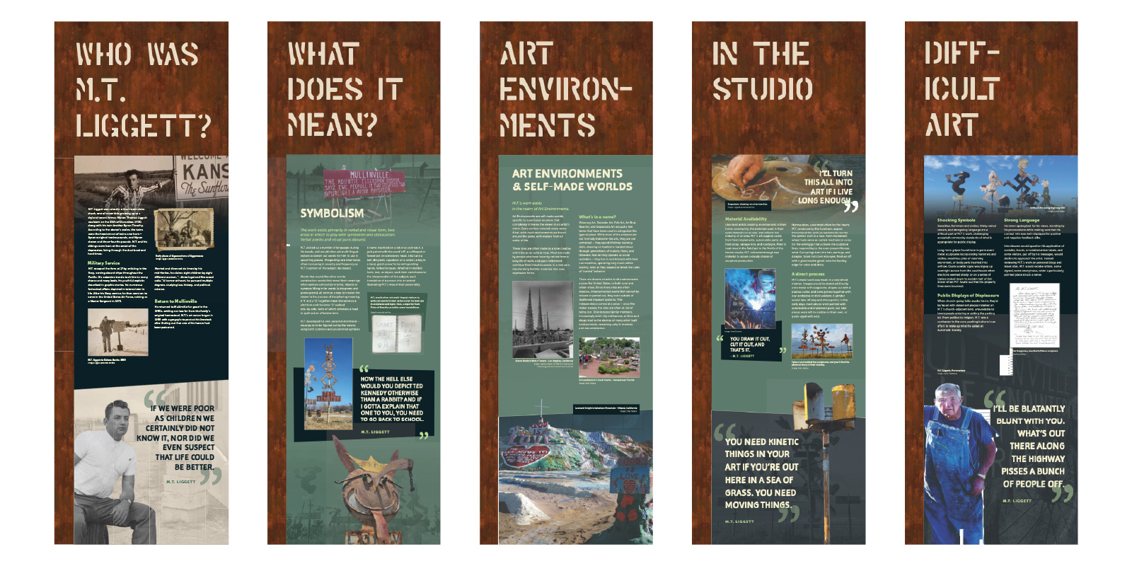
The exhibit content was written by guest curator, Erika Nelson. We worked closely with her and the 5.4.7 Arts Center to tell the story of Liggett's life, his contributions to folk art, and the controversy that his pieces provoked. The resulting exhibit provides a more complete context to the complex character that Liggett was.
Erica Nelson is also leading the preservation portion of the project, responsible for preserving his artwork for future generations.
Design & Displays
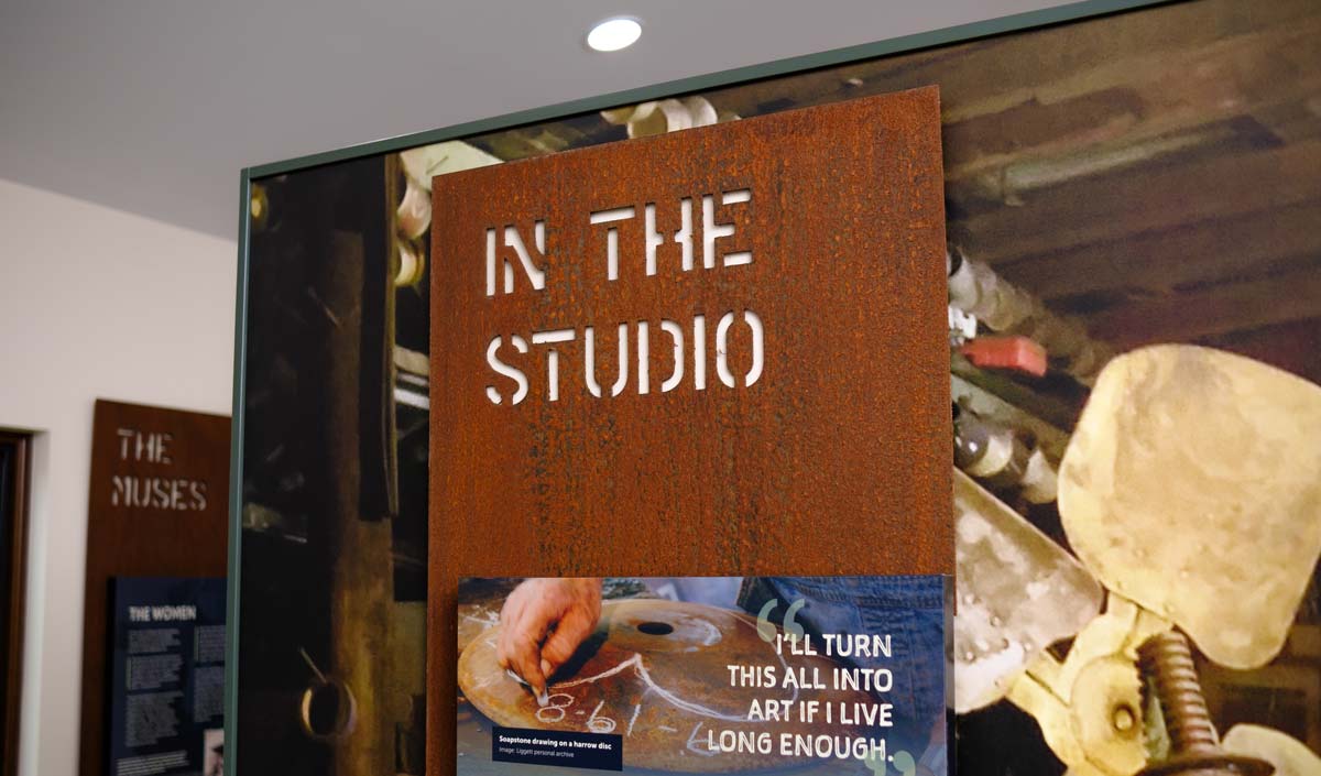
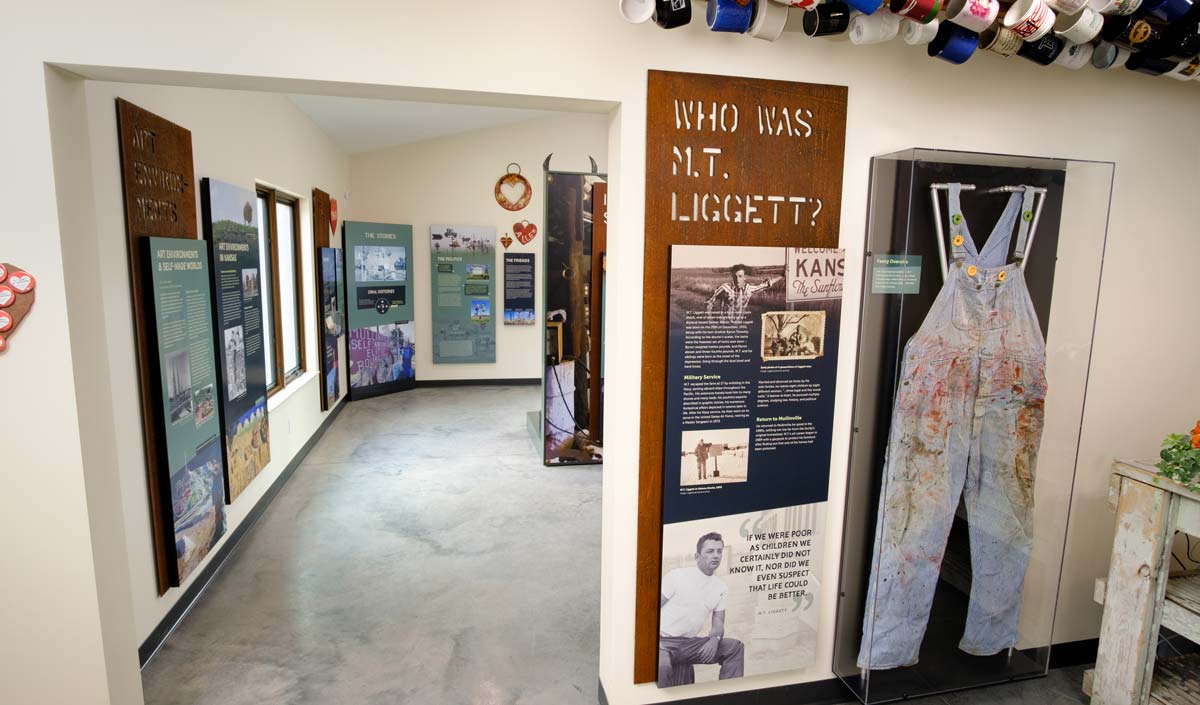
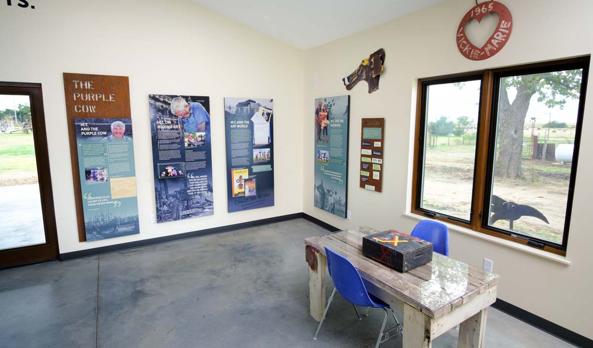
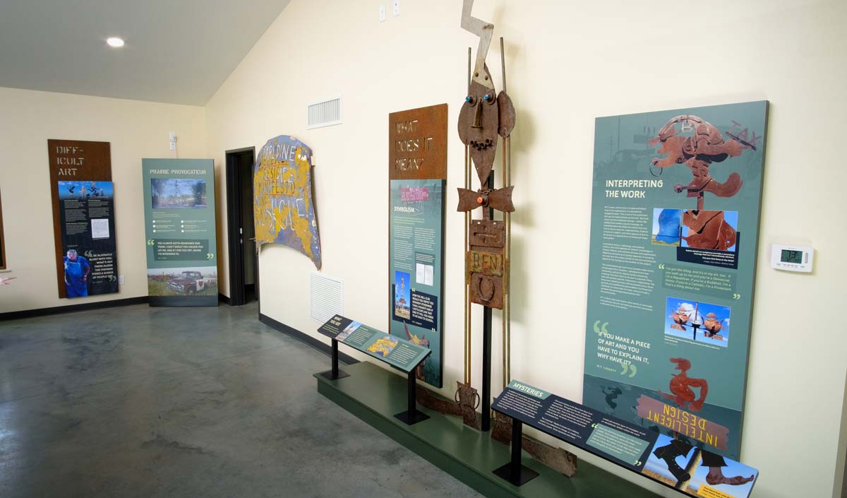
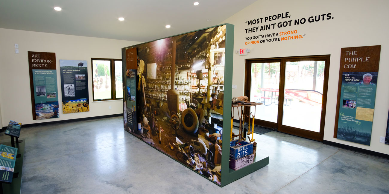
For the exhibit, we leaned on weathered steel motifs inspired by Liggett's use of materials. Laser-cut steel panels anchor the exhibit sections and provide a contrasting texture to the smooth, refined surface of the interpretation.
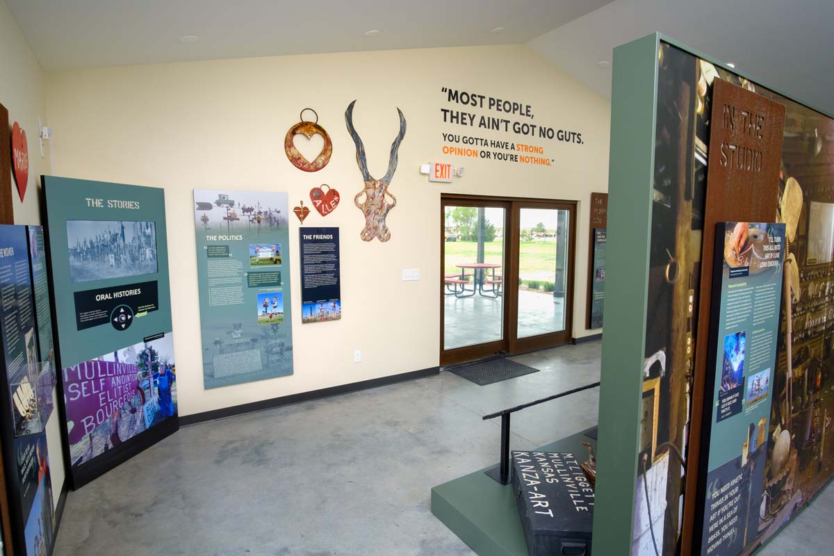
The design of the exhibit uses greens and dark blues in the interpretive panels and the painted surfaces which complement the weathered steel. We incorporated imagery, video, and a seemingly infinite supply of provocative quotes to engage visitors and provide a visual context to the story.

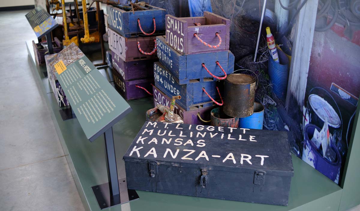
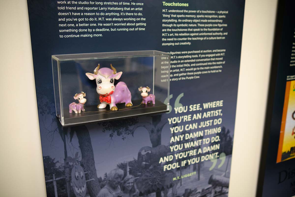
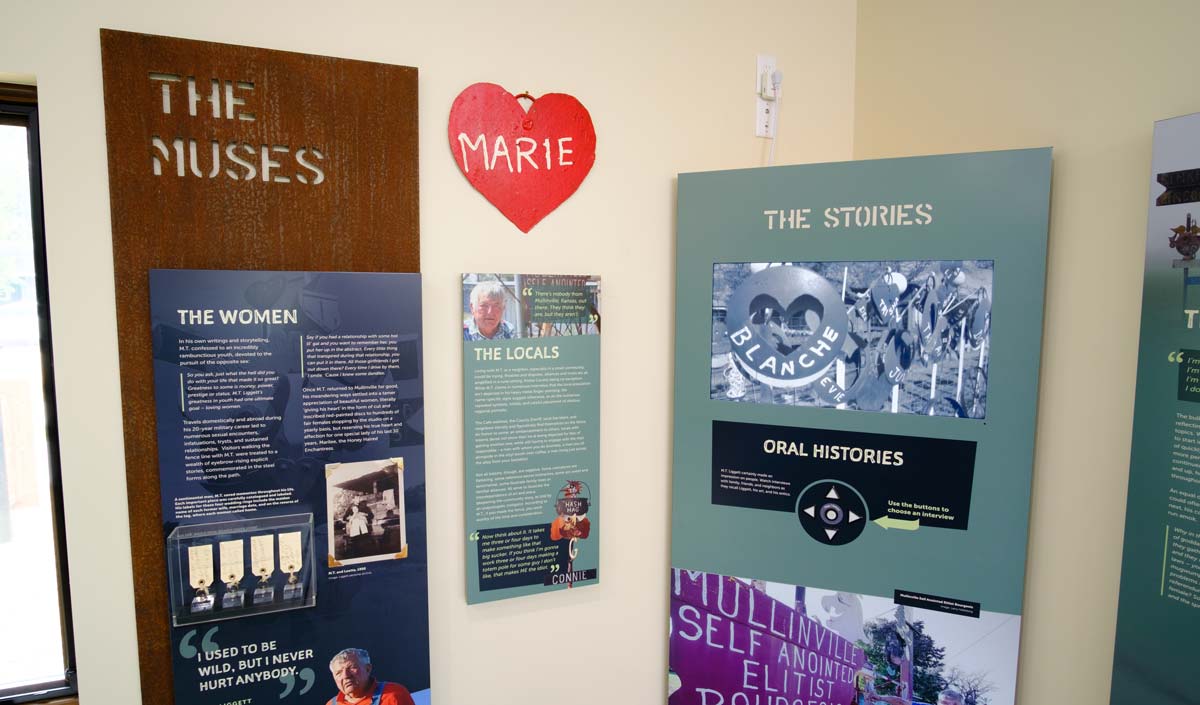
Much of the art is installed along the fenceline of Liggett's property where it originally stood. The artwork on display inside the exhibit help to illustrate different points of Liggett's creative process and artistic details.
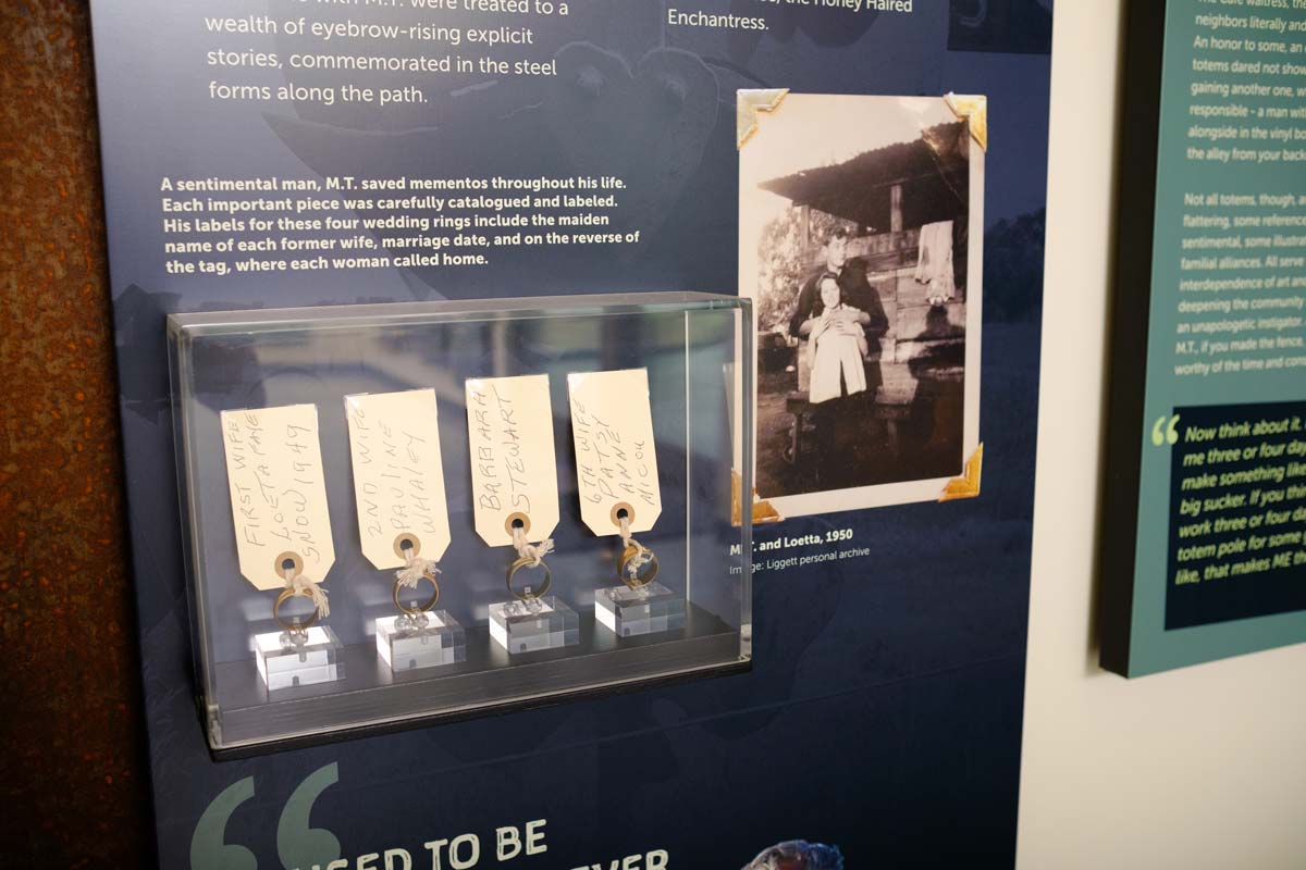
There were also several smaller artifacts of importance to include, such as a series of wedding rings. These artifact cases were mounted directly to the interpretive panels on the wall. This served to keep the artifacts close to their interpretive content and allowed us to keep the floor space as open as possible.
Also included in the exhibit are two interactive A/V units. Visitors can watch short documentaries that feature Liggett and his art, as well as interviews with Mullinville residents and their complicated relationships with Liggett.
We begin to see that Liggett had a more prickly personality that he put up or even over-sold when he was in front of a camera. It's also clear when watching the local interviews that Liggett had a slightly softer side that he reserved for a select few that were close to him.
Multiuse Space
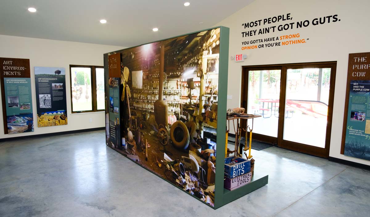
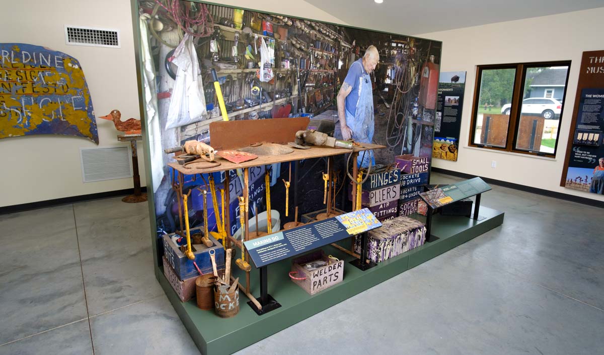
The interpretive space is compact and needs to function well for small gatherings in addition to telling Liggett's story. So we kept the interpretation to shallow displays around the exterior of the space, with a partial context studio display in the center of the room. When the visitors center needs a more open space for an event, the studio splits into two halves and can be pushed into spaces along the outer walls.
Outdoor Signage
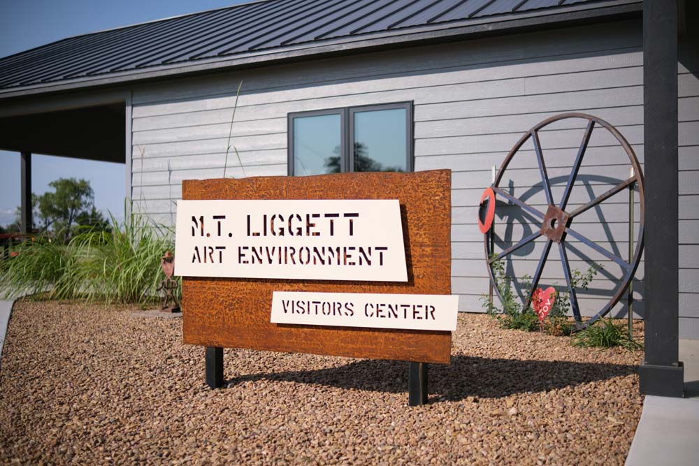
Even though the majority of our work was focused on the exhibit space inside, we also had the opportunity to design and fabricate an outdoor sign.
We went with a three-piece laser cut steel design. The weathered steel backer matches the exhibit title panels and the powder coated pieces are offset about an inch for a floating effect.
